Learn how to code email in HTML — expert guide
Tags:
code-email-in-htmlemail-codingemail-templateshtml-email-developmentresponsive-emailTo code an email that actually works, you have to forget modern web development. Forget Flexbox, forget Grid. Instead, you need to rely on outdated techniques, specifically nested <table> elements for your layouts.
Why? Because email clients, especially Microsoft Outlook, are notorious for their poor and wildly inconsistent support for modern web standards. This forces us into a more rigid, universally-supported coding style just to make sure emails don't fall apart when they land in someone's inbox.
Why coding HTML emails is so difficult
Before you write a single line of code, you need to accept one fundamental truth: building an HTML email is nothing like building a modern webpage. If you're coming from a web dev background, get ready to unlearn your best practices. It’s a trip back to the coding styles of the late 1990s.
This isn't just a stylistic choice. It's a practical necessity born from the fragmented and unpredictable world of email clients.
The biggest headache is the sheer variety of clients your subscribers use. We're talking everything from Gmail and Apple Mail to the legendary problem child, Microsoft Outlook. Each one uses its own rendering engine, interpreting your HTML and CSS in its own unique way.
The problem with rendering engines
Unlike web browsers, which have mostly standardized on a few engines like Blink (Chrome) or Gecko (Firefox), email clients are the wild west. For example, desktop versions of Outlook on Windows use Microsoft Word’s rendering engine.
Yes, you read that right. A word processor is responsible for displaying your carefully crafted code. This is exactly why modern CSS properties like Flexbox, Grid, and even some basic positioning are completely ignored. It simply can't handle them.
This forces us into a "lowest common denominator" approach. To ensure your email looks good everywhere—or at least doesn't break—you have to build it using techniques that even the oldest, most stubborn clients can understand.
The reality is that email development isn't about pushing the boundaries of what's possible with code. It's about achieving a consistent, predictable result across dozens of inconsistent environments. Reliability trumps modernity every single time.
Why we still use tables for layouts
This brings us to the cornerstone of modern email development: the humble <table> element. While tables for layout were rightfully abandoned in web design over a decade ago, they remain the only reliable method for structuring an HTML email.
Tables provide the rigid, predictable structure needed to control spacing, alignment, and columns across clients like Outlook that would otherwise mangle a <div>-based layout into an unreadable mess.
This environment comes with a unique set of constraints:
- Limited CSS Support: Many clients will strip
<style>tags from the<head>or completely ignore external stylesheets. This makes inline CSS a non-negotiable for critical styles. - No JavaScript: For obvious security reasons, scripting is universally blocked. Don't even think about it.
- Inconsistent Image Handling: Clients often block images by default or render them in unpredictable ways, making thoughtful
alttext an absolute necessity.
Getting a handle on these challenges is a critical part of understanding the broader field of Email Marketing, where technical execution is just as important as the message itself. Embracing these limitations isn't a step backward; it's the first step toward coding emails that actually work.
Your essential HTML email boilerplate
Every solid structure starts with a good blueprint, and for HTML email, that blueprint is your boilerplate. Trying to code an email without one is like building a house on sand—you're just asking for trouble down the line. A battle-tested boilerplate ensures maximum compatibility across the frustratingly inconsistent world of email clients and saves you from reinventing the wheel for every campaign.
This isn't just about having a starting point. It's about proactively solving for the most common rendering bugs before they even have a chance to show up. Let's dig into the non-negotiable pieces every professional HTML email needs.
Set the stage with doctype and meta tags
First things first, your boilerplate absolutely must begin with the correct Document Type Declaration (DOCTYPE). While the rest of the web has moved on to HTML5, email development is famously stuck in the past, favoring older standards that have wider support.
Using <!DOCTYPE html PUBLIC "-//W3C//DTD XHTML 1.0 Transitional//EN" "http://www.w3.org/TR/xhtml1/DTD/xhtml1-transitional.dtd"> is the way to go. It tells email clients exactly how to interpret your code, which is a huge step toward consistent rendering. Right after that, you need to pack your <head> section with a few crucial meta tags.
- Character Encoding:
<meta http-equiv="Content-Type" content="text/html; charset=UTF-8" />is your guarantee that all text and special characters (like emojis or accented letters) show up correctly, no matter the language or platform. - Viewport for Responsiveness:
<meta name="viewport" content="width=device-width, initial-scale=1.0">is the lynchpin for mobile design. It tells the client to match the email's width to the device's screen, laying the groundwork for a responsive layout. - Color Scheme Support: Adding
<meta name="color-scheme" content="light dark">and<meta name="supported-color-schemes" content="light dark">signals to clients like Apple Mail that your design is ready for both light and dark modes.
Skipping these might seem like a small shortcut, but it's a recipe for broken layouts and garbled text. Don't do it.
Tame Outlook with conditional comments
Ah, Microsoft Outlook. It remains the single biggest headache for email developers because it uses Microsoft Word’s rendering engine. Yes, you read that right. To wrestle its quirks into submission, we turn to conditional comments—special blocks of code that only Outlook can see.
For instance, you can wrap Outlook-specific code inside <!--[if mso]>. This is a lifesaver for applying targeted fixes, like correcting spacing issues or forcing a table structure that other clients don't need, all without messing up how your email looks in Gmail or Apple Mail.
Think of conditional comments as your secret weapon. They let you write clean, modern code for the good email clients while slipping in a separate set of instructions just for the most difficult one. It’s how you get a consistent experience everywhere.
Getting these fundamentals right is a huge part of the job. If you want to go deeper, our complete guide on https://craftingemails.com/coding-email-templates covers more advanced techniques. Remember, email coding has its own strict set of rules, very different from standard web development, all designed to make sure things don't break across dozens of email clients.
Build bulletproof layouts with tables
Alright, let's get into the real heart of HTML email development. This is where we say goodbye to modern web standards like divs and flexbox and embrace the humble <table>. Why? Because in the Wild West of email clients, tables aren't just an option; they are the only thing you can truly trust to hold your design together.
This isn't a step backward. It's a strategic decision to build something that won't fall apart the second it lands in a tricky inbox.
The core idea is beautifully simple: wrap your entire email in one main container table. This acts as a rigid frame, preventing clients like Outlook from doing what they love most—stretching your design to fill the entire screen, often with disastrous results. Inside this container, every piece of your content (the header, the body copy, the footer) gets its own row (<tr>) and cell (<td>). This forces a reliable, single-column structure that is nearly impossible for email clients to mess up.
Even a simple design can look professional and polished when you apply styles with care, as this example shows.
This just goes to show that great HTML email coding is all about precision—applying the right attributes and styles in the right places to ensure maximum compatibility.
Master essential table attributes
As you start building, you'll quickly realize that CSS properties like margin and padding are incredibly unreliable. Don't even bother with them on block-level elements. Instead, you'll control your layout directly in the HTML using a handful of battle-tested attributes.
Here's a quick rundown of the HTML attributes that will become your best friends when wrangling table-based layouts for email.
| HTML Attribute | Purpose in Email Coding | Example Usage |
|---|---|---|
cellpadding="0" | Removes the default internal spacing inside a | <td cellpadding="0"> |
cellspacing="0" | Eliminates the space between table cells, ensuring your layout components sit flush against each other without ugly gaps. | <table cellspacing="0"> |
border="0" | Prevents some email clients from rendering a default thin border around your tables, which can ruin a clean design. | <table border="0"> |
align="center" | The most reliable method for centering your main email container within the client's viewport. | <table align="center"> |
By using these attributes, you're essentially speaking a universal language that even the oldest, quirkiest email clients can understand perfectly. This is the bedrock of a bulletproof layout.
The Outlook-saving ghost table technique
Even with a solid container, you'll run into a classic problem: desktop versions of Outlook on wide screens. They love to stretch fluid-width emails into an unreadable mess. This is where a clever workaround known as the "ghost table" saves the day.
It's a fixed-width table wrapped in conditional comments that only Outlook can see.
<!--[if mso]>
<table role="presentation" border="0" cellpadding="0" cellspacing="0" width="600" align="center" style="width:600px;">
<tr>
<td>
<![endif]-->

<!-- Your main fluid container table goes here -->

<!--[if mso]>
</td>
</tr>
</table>
<![endif]-->
What this code does is create a rigid, 600px wide container just for Outlook, forcing it to constrain your email's width. For every other email client, this code is completely invisible, allowing your responsive design to function exactly as you intended.
The ghost table is a perfect example of the email developer's mindset. It’s not about finding one solution that works everywhere, but about creating targeted fixes for specific, problematic clients without compromising the experience for everyone else.
Honestly, this technique is a non-negotiable for anyone serious about professional HTML email development. It elegantly solves one of the most persistent headaches in the field and ensures your hard work looks great everywhere, even in the most challenging inboxes.
Style your email for every device
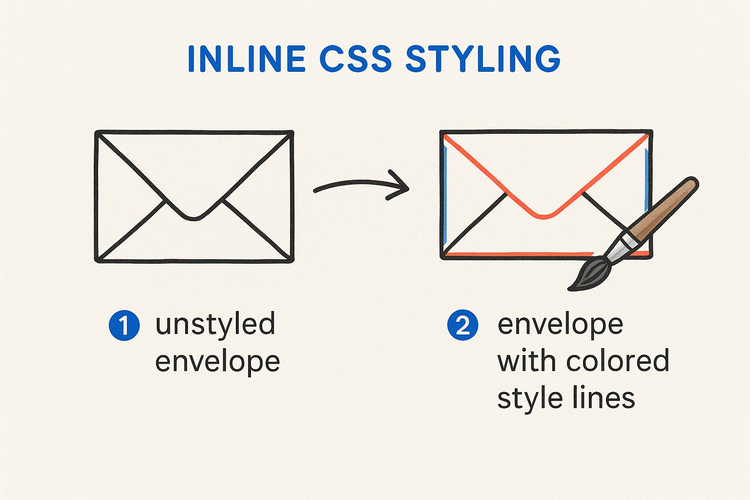
Once you have your table-based structure locked down, it's time to make it look good. Styling an HTML email is a whole different beast compared to styling for the web. You have to contend with a bizarre landscape of email clients, where some (looking at you, older Outlook versions) will happily strip out any CSS you place in a <style> block.
This means your most reliable tool is something that might feel like a blast from the past: inline CSS. You’ll be applying styles for fonts, colors, padding, and more directly onto your <td> elements using the style attribute. It’s not elegant, but it's the only way to guarantee your design shows up as intended, everywhere.
The power of inline CSS
Think of inline styles as your email’s unbreakable foundation. Every single critical visual element—background colors, font families, text alignment—needs to be defined this way.
For instance, you won't be assigning a class to a button. Instead, you'll style the table cell (<td>) that acts as the button container directly.
<td align="center" style="background-color: #007bff; border-radius: 4px;">
	<a
		href="#"
		style="color: #ffffff; text-decoration: none; display: inline-block; padding: 12px 24px; font-family: Arial, sans-serif; font-size: 16px;"
	>
		Click Here
	</a>
</td>
This direct application is your defense against quirky email clients that love to ignore your carefully crafted styles. Yes, it makes your HTML a lot more verbose, but the reliability you gain is absolutely worth it.
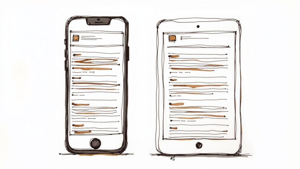
Embrace responsive design with media queries
Of course, you can't do everything inline, especially when it comes to making your email look sharp on a phone. And with a staggering 85% of emails now opened on mobile devices, responsive design isn’t just a nice-to-have; it's a necessity.
This is where media queries save the day.
You'll place your media queries inside a <style> block in the <head> of your document. While some desktop clients will ignore this, the ones that truly matter for mobile—like Apple Mail, Gmail, and modern Android clients—fully support them.
This layered approach is the secret sauce of modern email development. You set a universal baseline with inline CSS that works everywhere, then use media queries to progressively enhance the experience for mobile users.
A classic move is to target screens smaller than 600px. Inside that query, you can override your inline styles to create a much more mobile-friendly layout.
Here are a few common tricks of the trade:
- Go Full-Width: Force your main container table to expand to 100% of the screen width.
- Stack Your Columns: Take a two-column desktop layout and make the columns stack vertically on mobile.
- Boost Font Sizes: Make text larger and more readable on smaller screens.
- Hide Desktop Clutter: Use
display: none !important;to hide decorative elements that just get in the way on mobile.
To really get this right, you need to understand the core tenets of best practice email design. Mastering this dual approach—inline CSS for rock-solid compatibility and media queries for a beautiful mobile experience—is how you create emails that look fantastic for every single subscriber.
Make your HTML emails accessible
If an email isn’t accessible, it fails. Simple as that. When you’re deep in the code, wrestling with Outlook rendering bugs, it’s all too easy to forget about the users who depend on assistive technologies. But accessibility isn't some "nice-to-have" feature; it's a core part of building a professional, effective email.
The scale of this problem is staggering. A deep dive into over 443,000 HTML emails found that a shocking 99.89% had 'Serious' or 'Critical' accessibility issues. Think about that for a second. Less than 0.01% managed to pass all automated checks, which points to a massive, systemic blind spot in how most emails are built.
Ignoring accessibility doesn't just shut out a portion of your audience. It can also ding your deliverability and degrade the experience for everyone.
Tell screen readers what your tables are for
The very first, and arguably most important, fix is to let screen readers know that your tables are just for layout. By default, a screen reader will announce a table’s rows and columns, which creates a nonsensical and confusing mess for anyone just trying to read your content.
The fix is dead simple: just add role="presentation" to every layout <table> tag you use.
This one little attribute tells the screen reader to skip the table structure and just read the content inside it, in order. It's a tiny bit of code that makes a world of difference for non-visual users.
Write ALT text that actually helps
Every single image in your email needs descriptive ALT text. This isn't just an old SEO trick; it's the text a screen reader announces when it hits an image. It's also what everyone sees if their email client blocks images by default.
- Ditch the generic text: Never use "image" or "graphic." Your job is to describe the image's content and its purpose in the email.
- Be concise but descriptive: For a product shot, something like "A blue running shoe with white laces" is infinitely more helpful than just "shoe.jpg."
- Handle decorative images correctly: If an image is purely decorative, like a fancy divider line, use empty ALT text (
alt=""). This is a clear signal for screen readers to skip right over it.
Accessibility isn't an extra step you tack on at the end. It's a fundamental part of the coding mindset. When you build emails that work for everyone, you create a more professional and inclusive experience that ultimately benefits your entire audience.
Finally, don’t forget to check your color contrast. If text is tough for a sighted person to read, it's completely impossible for someone with a visual impairment. Use an online contrast checker to make sure your text and background colors are distinct enough for your message to be clear to everyone.
And if you have more questions, our frequently asked questions about email templates is a great place to find answers.
Test and troubleshoot your code
You've built your layout with tables and meticulously applied inline styles. The code looks solid, but your job isn't even close to done. When you're coding an HTML email, the final and most critical phase is rigorous testing.
Sending an email without previewing it across major clients is like flying blind—you’re just hoping it doesn’t crash and burn on arrival.
Sending a test to your own Gmail or Outlook account is a good first step, but it’s dangerously insufficient. Your subscribers use a huge variety of clients and devices, and every single one has its own rendering quirks. What looks perfect in Apple Mail might be a complete disaster in Outlook on Windows.
Why real testing services are non-negotiable
This is where dedicated testing platforms become your best friend. Services like Litmus or Email on Acid are the industry standard for a good reason: they generate real screenshots of your email across dozens of clients and devices in just a few minutes. This gives you a comprehensive view that you could never, ever achieve manually.
These platforms let you spot common, frustrating rendering bugs before your subscribers do. Think of things like:
- Phantom Spacing in Gmail: Those infuriating, unexplained gaps that appear between your table cells.
- Broken Layouts in Outlook: Your beautiful multi-column design collapsing into a single, jumbled mess.
- Unresponsive Behavior on Mobile: Media queries getting completely ignored, forcing your mobile users to pinch and zoom a tiny desktop view.
Think of a testing service as your quality assurance team. It’s an investment that pays for itself by protecting your brand's reputation and ensuring every subscriber gets the pixel-perfect experience you intended.
Automate your CSS inlining
One of the most tedious, soul-crushing parts of email development is manually moving all your CSS from a <style> block into inline style attributes on each HTML element. This process, known as inlining, is crucial for compatibility but is also incredibly prone to human error.
Luckily, you don't have to do it by hand. Automated inlining tools are an absolute lifesaver.
You can paste your entire HTML file—with the CSS still neatly in the <style> block—and the tool will automatically process it, moving all the styles inline for you. This saves a massive amount of time and prevents countless potential mistakes.
Ultimately, a robust testing and troubleshooting process is what separates amateur emails from professional ones. For a deeper dive into common issues, our email templates video tutorials offer visual walkthroughs of troubleshooting techniques. And once the code is solid, don't forget the strategy.
Using Maizzle framework 3x faster than manual inlining
Another option for streamlining your workflow is the Maizzle framework. It’s designed for building HTML emails with Tailwind CSS. Instead of applying inline styles manually, you can write utility classes during development. When you run the build process, Maizzle compiles and inlines everything automatically.
This approach helps keep your source code clean and easier to maintain, while still producing the fully inlined, email-ready output required for client compatibility.
At craftingemails, your emails are built with a focus on reliability and clarity. Every template is coded with Tailwind CSS and compiled through the Maizzle framework, then tested to ensure it renders consistently across major clients. That way, you can focus on the message, knowing the code is taken care of. Let us talk about your email needs.