7 Unmissable best practices for email design in 2025
Tags:
best-practices-for-email-designecommerce-emailemail-design-tipsresponsive-email-designsaas-email-marketingIn the crowded digital marketplace, a well-designed email is your direct line to customer engagement, cutting through the noise to deliver value and drive action. It's no longer enough to just send emails; they must be visually compelling, functionally seamless, and perfectly tailored to every recipient. For SaaS and eCommerce businesses, this distinction is critical: it's the difference between an email being immediately deleted and one that drives conversions.
Mastering the fundamentals of email design is non-negotiable for building customer relationships and achieving marketing goals. A strategic approach ensures your message not only reaches the inbox but also resonates with the user, guiding them effortlessly from opening the email to clicking your call-to-action. This guide moves beyond generic advice to provide a detailed roadmap covering the most impactful best practices for email design.
We will explore seven essential pillars that transform your campaigns from simple messages into powerful conversion engines. You will learn actionable strategies for:
- Crafting mobile-first responsive layouts.
- Designing clear and compelling calls-to-action (CTAs).
- Establishing a scannable content hierarchy.
- Maintaining brand consistency and visual identity.
- Implementing strategic personalization and segmentation.
- Ensuring accessibility and inclusive design.
- Optimizing subject lines and preheader text.
Each section provides specific, practical insights to help you build emails that capture attention and deliver results. For a comprehensive understanding of all aspects, including mobile-first strategies and effective layouts, explore this complete guide to best practice email design. Let's dive in and craft emails that truly connect.
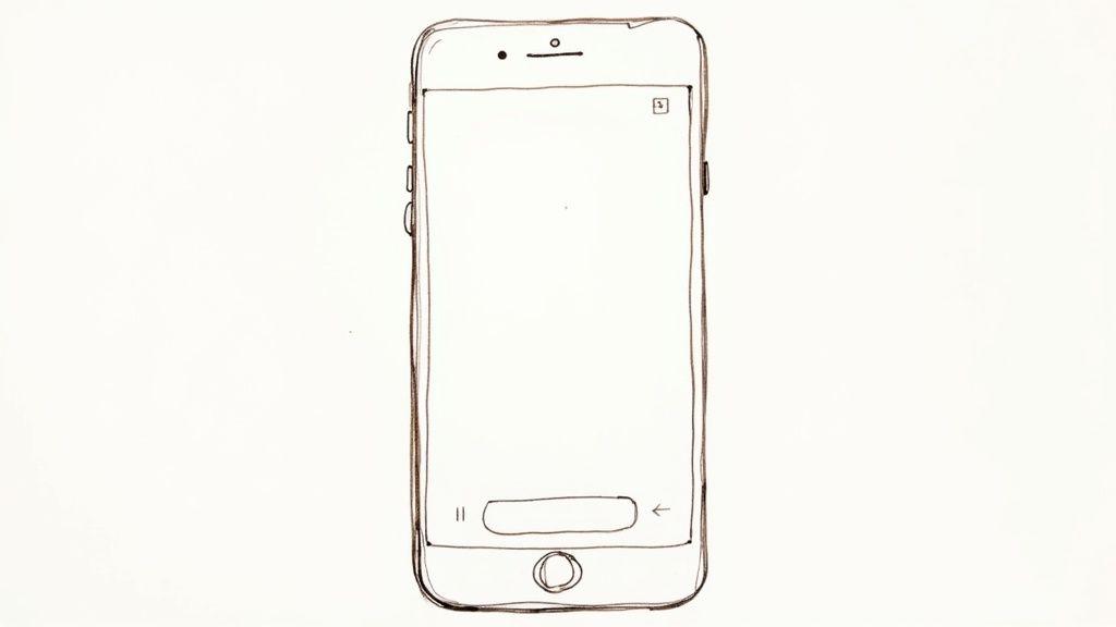
1. Mobile-first responsive design
Prioritizing the mobile experience is no longer optional; it's a fundamental requirement for effective communication. Mobile-first responsive design is a strategic approach where you design an email for the smallest screen first and then progressively enhance it for larger screens like tablets and desktops. Given that over 60% of emails are now opened on mobile devices, this method ensures your message is not just delivered, but is also readable, engaging, and functional for the majority of your audience.
This approach, popularized by thought leaders like Luke Wroblewski, flips the traditional design process on its head. Instead of designing a complex desktop layout and then trying to shrink it down, you start with the core content and functionality needed for a mobile user. This forces you to focus on clarity and essential information, which ultimately benefits users on all platforms.
Why mobile-first is a core best practice for email design
Adopting a mobile-first mindset from the outset delivers significant advantages. It guarantees a seamless user experience, reducing friction and frustration for on-the-go subscribers. This directly impacts engagement metrics like open rates, click-through rates, and conversions. A clean, single-column layout, large touch-friendly buttons, and legible font sizes are hallmarks of this approach, making interaction effortless. For example, Airbnb's promotional emails use this tactic perfectly, featuring a single, compelling call-to-action and beautiful imagery that looks stunning on a phone.
Actionable tips for implementation
To effectively implement mobile-first responsive design, focus on these key strategies:
- Embrace the Single-Column Layout: This is the most reliable structure for mobile emails. It creates a clear, linear path for the reader to follow, eliminating horizontal scrolling and confusing multi-column layouts on small screens.
- Design Touch-Friendly CTAs: Buttons should be a minimum of 44x44 pixels to be easily tappable. Use generous padding (around 15-20px) around all clickable elements to prevent accidental clicks and improve usability.
- Optimize Your Preheader and Subject Line: Mobile email clients show fewer characters. Keep your subject line under 50 characters and use the preheader text to provide a compelling summary, as it's highly visible in mobile inboxes.
- Use Progressive Enhancement: Start with a simple, functional HTML structure for mobile. Then, use CSS media queries to add more complex elements, such as multi-column layouts or advanced styling, for screens above a certain width (e.g., 600px).
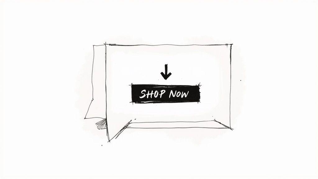
2. Clear and compelling call-to-action (CTA)
The Call-to-Action (CTA) is the strategic linchpin of your email design, serving as the bridge between your message and the desired conversion. An effective CTA is not just a button; it's a strategically placed, visually prominent element that uses action-oriented language and clear design cues to guide recipients toward a specific outcome. Its primary goal is to eliminate ambiguity and make it incredibly easy for your audience to take the next step, whether that's making a purchase, signing up for a webinar, or reading a blog post.
The principles behind a strong CTA are rooted in foundational marketing concepts championed by figures like David Ogilvy and refined for the digital age by platforms like HubSpot and Unbounce. They understood that clarity, urgency, and a compelling value proposition are essential to driving action. In email design, this translates to creating a focal point that captures attention and communicates its purpose instantly.
Why a strong CTA is a core best practice for email design
A well-designed CTA is the single most critical element for improving email performance. It directly impacts your click-through and conversion rates by providing a clear, frictionless path for your subscribers. A weak, confusing, or hidden CTA will render the rest of your beautifully crafted email useless. The best CTAs use a combination of contrasting colors, compelling copy, and strategic placement to stand out from the rest of the email content. For example, Netflix’s iconic red "Join Free for a Month" button is a masterclass in using color, value, and action-oriented text to drive sign-ups.
Actionable tips for implementation
To create CTAs that convert, focus on optimizing their design, copy, and placement:
- Use Action-Oriented and First-Person Language: Instead of passive phrases, use strong verbs that prompt action. Phrasing it in the first person, such as "Get My Free Trial" instead of "Get Your Free Trial," can create a sense of ownership and has been shown to increase clicks.
- Create Visual Contrast: Your CTA button should stand out. Use a color that contrasts with your email’s background but still aligns with your brand palette. Amazon's consistent use of orange for its "Shop Now" buttons makes them instantly recognizable and clickable.
- Limit Your Primary CTAs: To avoid decision fatigue, focus on one primary CTA per email. If secondary actions are necessary, use a less prominent style, like a text link, to maintain a clear visual hierarchy and guide users to the most important action.
- Ensure It's Bulletproof: Design your CTA using HTML and CSS, not just an image. This ensures it will render and remain clickable even if a recipient's email client has images turned off by default, a crucial aspect of robust email design.
3. Scannable content hierarchy
A scannable content hierarchy organizes email information so recipients can quickly grasp key messages without reading every word. This approach acknowledges the reality of user behavior; most people scan emails, looking for points of interest before committing to a full read. By using strategic headers, bullet points, white space, and visual cues, you create an intuitive path for the reader's eye, ensuring your core message is absorbed instantly.
This concept, heavily influenced by the web usability research of pioneers like Jakob Nielsen, is a cornerstone of effective digital communication. It's not about "dumbing down" your content but rather respecting your audience's time and attention span. By making information easy to find, you lower cognitive load and make it more likely that users will engage with your call-to-action.
Why a scannable hierarchy is a core best practice for email design
Implementing a strong visual hierarchy is one of the most impactful best practices for email design because it directly boosts comprehension and engagement. When a subscriber opens your email, they should be able to understand its primary purpose within seconds. A scannable design facilitates this rapid understanding, preventing users from feeling overwhelmed and hitting the delete button. Newsletters like Morning Brew and TheSkimm master this technique, using bold headings, concise summaries, and bullet points to deliver complex information in a highly digestible format. This clarity builds trust and keeps subscribers opening your emails day after day.
Actionable tips for implementation
To effectively implement a scannable content hierarchy, focus on these key strategies:
- Follow the Inverted Pyramid: Place your most crucial information, such as the main offer or key takeaway, at the very top of the email. Follow this with supporting details and end with general or background information.
- Use Strong Visual Cues: Create a clear distinction between different content levels. Use bold, larger font sizes for headlines, and contrasting colors for subheadings. This guides the reader’s eye naturally through the content.
- Break Up Text with White Space: Generous use of white space, or negative space, around text blocks, images, and buttons is critical. It prevents the design from looking cluttered and helps individual elements stand out.
- Leverage Bullet Points and Numbered Lists: When presenting features, benefits, or steps, use lists instead of long paragraphs. This format is inherently scannable and allows readers to process information quickly and efficiently.
- Implement the 5-Second Rule: Design your email so that the main message and the primary call-to-action are unmistakably clear within five seconds of opening it. If a user can’t figure out what you want them to do in that time, your hierarchy isn't strong enough.
4. Brand consistency and visual identity
Establishing brand consistency in email design is crucial for building a recognizable and trustworthy presence in the inbox. This practice involves the coherent application of your brand’s visual identity, including logos, color palettes, typography, imagery style, and tone of voice, across all email communications. It ensures that every email, whether promotional or transactional, feels like a natural extension of your brand, creating a seamless and reliable experience for subscribers.
This principle, rooted in the brand equity theories of experts like David Aaker, transforms your email from a simple message into a powerful brand asset. By consistently reinforcing your visual identity, you make your brand instantly identifiable, which helps cut through the noise of a crowded inbox. It fosters familiarity and trust, which are essential for long-term customer loyalty and engagement.
Why brand consistency is a core best practice for email design
Maintaining a consistent visual identity is a non-negotiable best practice for email design because it directly impacts brand recognition and credibility. When subscribers can immediately identify your emails, they are more likely to open them. This consistency projects professionalism and reliability, assuring customers that they are interacting with a legitimate and established brand. For example, Apple's emails are unmistakable due to their minimalist aesthetic, clean typography, and high-quality product imagery, perfectly mirroring their overall brand identity. Similarly, Mailchimp's friendly tone and signature yellow color create a cohesive and approachable brand experience in every communication.
Actionable tips for implementation
To effectively implement brand consistency and a strong visual identity, focus on these key strategies:
- Develop a Brand Style Guide for Email: Create a dedicated guide that outlines specific rules for logo usage, color codes (HEX), font families and sizes, button styles, and imagery guidelines. This serves as a single source of truth for your team.
- Create Branded Email Templates: Build a set of master templates for different email types (e.g., newsletters, promotions, transactional receipts) that have your brand elements pre-built. This ensures consistency regardless of who creates the email.
- Maintain a Consistent Tone of Voice: Your brand's personality should shine through in your copy. Whether you are witty, formal, or friendly, ensure the language in your subject lines, headlines, and body copy is consistent.
- Use a Consistent Sender Profile: Always use the same sender name (e.g., "Team Notion") and a recognizable from-address. This simple step builds familiarity and trust directly in the inbox preview. For large-scale email campaigns and long-term consistency, consider creating effective design system documentation to keep everyone aligned.
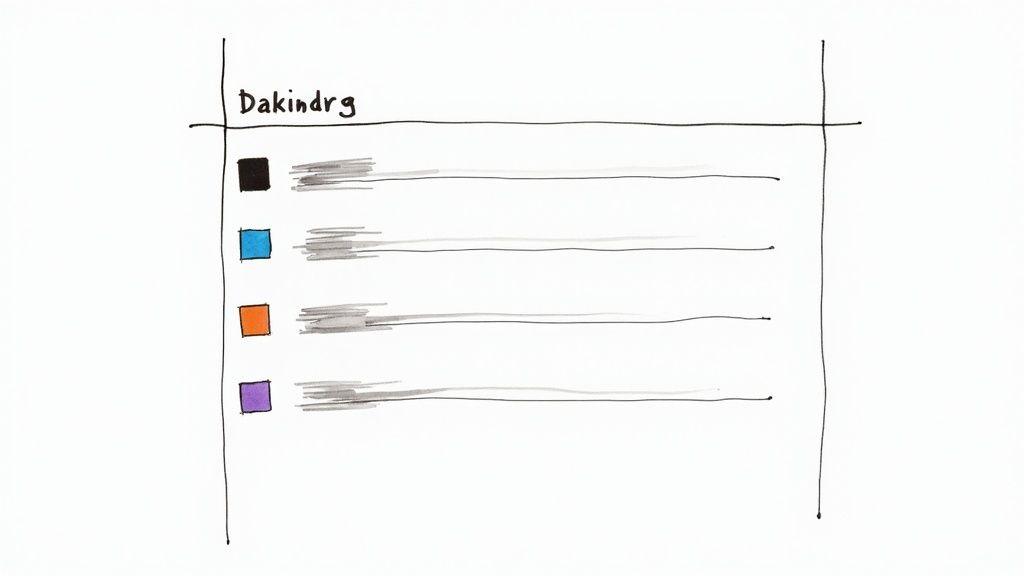
5. Strategic personalization and segmentation
Moving beyond a simple {{first_name}} merge tag, strategic personalization is the practice of delivering highly relevant and targeted content based on a subscriber's behavior, preferences, and history. When combined with smart audience segmentation, this approach transforms a generic email blast into a meaningful one-to-one conversation. This is one of the most powerful best practices for email design because it directly addresses the user's individual context, making them feel seen and understood.
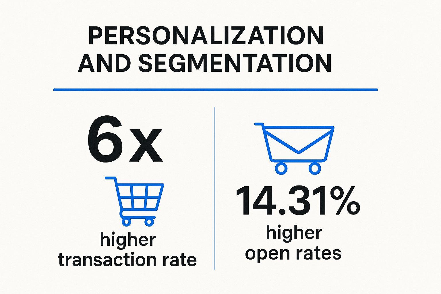
The data speaks for itself, showing how personalized campaigns significantly outperform generic ones in key engagement metrics. This visualization highlights the proven impact on both opens and transactions. These figures underscore why personalization is not just a "nice-to-have" feature but a critical driver of revenue and customer loyalty in modern email marketing.
Why strategic personalization is a core best practice for email design
Adopting a strategy of deep personalization and segmentation creates more effective and resonant email experiences. It directly increases engagement by delivering content that subscribers genuinely care about, which reduces unsubscribe rates and builds stronger brand affinity. For example, Spotify's personalized "Wrapped" summaries and weekly discovery playlists are masterclasses in using data to create emails that users eagerly anticipate. Similarly, Amazon's recommendation engine drives sales by showing customers products related to their recent browsing and purchase history.
Actionable tips for implementation
To effectively implement strategic personalization and segmentation, focus on these key strategies:
- Start with Foundational Segments: Begin by grouping your audience based on accessible data points. Create segments for new subscribers, loyal customers, inactive users, and those who have abandoned a cart.
- Use Progressive Profiling: You don't need to ask for all information at once. Use subsequent emails or on-site forms to gradually collect more data, such as preferences, interests, or demographic details, to enrich your profiles over time.
- Leverage Dynamic Content: Use dynamic content blocks to show different images, offers, or calls-to-action to different segments within the same email campaign. This allows you to scale personalization efficiently.
- Ensure Data Hygiene: Personalization is only as good as the data powering it. Regularly clean your database to remove outdated information and ensure accuracy, preventing misdirected or irrelevant messaging. For a deeper dive, explore our complete guide on Strategic Personalization and Segmentation.
6. Accessibility and inclusive design
Designing for accessibility is not just a compliance checkbox; it is a core principle of creating emails that are usable and effective for every single person in your audience. Email accessibility ensures content can be understood and interacted with by people with various disabilities, including visual, auditory, motor, and cognitive impairments. By adhering to inclusive design principles, you create a more equitable and engaging experience, broadening your reach and strengthening brand trust.
This approach is heavily guided by established standards like the Web Content Accessibility Guidelines (WCAG) and championed by advocates like WebAIM and Mark Robbins. It involves a conscious effort to remove barriers that prevent interaction. Instead of treating accessibility as an afterthought, integrating it from the start of the design process ensures your message is not just sent, but truly received by everyone.
Why accessibility is a core best practice for email design
Adopting an inclusive design mindset is a fundamental best practice for email design because it directly impacts your audience reach and overall campaign effectiveness. An accessible email is one that works seamlessly with assistive technologies like screen readers, respects user preferences for contrast, and is navigable without a mouse. This thoughtful approach prevents you from alienating up to 15% of the global population with disabilities. Companies like Target excel here, using high-contrast text and comprehensive alt text to ensure their promotional emails are clear and informative for all subscribers. This commitment not only builds brand loyalty but also unlocks potential revenue from a wider customer base.
Actionable tips for implementation
To make your emails accessible and inclusive, focus on these critical strategies:
- Write Meaningful Alt Text: For every functional or informative image, provide descriptive alternative text that conveys its purpose and meaning. Instead of "Image of a blue shoe," write "A person tying the laces on a pair of blue running shoes." For decorative images, use an empty alt attribute (
alt="") so screen readers skip them. - Ensure Sufficient Color Contrast: Text must be clearly distinguishable from its background. Use a tool like WebAIM's contrast checker to validate your color combinations, aiming for a minimum contrast ratio of 4.5:1 for normal text and 3:1 for large text (18pt or 14pt bold).
- Structure Content with Semantic HTML: Use HTML tags correctly to define the structure of your email. Use heading tags (
<h1>,<h2>) in a logical order, paragraph tags (<p>) for text blocks, and table roles (role="presentation") for layout tables to ensure screen readers can interpret the content correctly. - Design with Clarity in Mind: Do not rely solely on color to convey important information, such as link states or error messages. Combine color with other visual cues like icons, underlines, or bold text. Left-align text for better readability and maintain a logical, linear reading order.
7. Optimized subject lines and preheader text
Before a subscriber ever sees your beautifully crafted design, they see your subject line and preheader text. These two elements are the gatekeepers to your content, acting as a powerful 'one-two punch' to capture attention in a crowded inbox. Optimizing them isn't just a copywriting task; it's a critical component of email design strategy, as they determine whether your design even gets a chance to be seen.
The art of the headline, championed by advertising legends like David Ogilvy, directly applies here. Your subject line is the headline, and the preheader is the sub-headline. They must work in harmony to communicate value and create enough intrigue to earn a click. This strategy was famously demonstrated by Barack Obama's 2012 campaign, which used simple, personal subject lines like "Hey" to cut through the noise and achieve record-breaking open rates.
Why subject line & preheader optimization is a core best practice for email design
Optimizing your subject line and preheader directly impacts the most important initial metric: the open rate. This is the first and most crucial conversion in any email campaign. A compelling subject line piques curiosity, while the preheader provides context and a secondary reason to engage. This combination builds anticipation and sets clear expectations for the email's content. For example, Groupon excels at this by using value-focused subject lines like "70% Off Local Restaurants," immediately communicating a tangible benefit to the reader.
Actionable tips for implementation
To effectively optimize your subject lines and preheaders, focus on these key strategies:
- Front-Load Key Information: Mobile devices truncate long subject lines. Place the most important words and the core benefit at the very beginning to ensure they are visible, even in a shortened preview.
- Use Specificity and Numbers: Vague statements are forgettable. Use numbers and specific details to make your offer more concrete and believable. "Save 25% on All Sneakers Today" is far more effective than "Great Deals Inside."
- Make the Preheader Complementary: Don't just repeat the subject line. Use the preheader to add context, create urgency, or present a call to action. It’s valuable real estate to expand on your initial message.
- A/B Test Your Approach: Don't guess what works best. Continuously test different styles. Pit a curiosity-driven subject line (e.g., "You won't believe this") against a direct-benefit one (e.g., "Your weekly marketing report is here") to see what resonates with your audience. For more guidance on this, explore the 8 Types of the Best Email Subject Line to Use in 2025.
- Avoid Spam Triggers: Steer clear of overused, salesy words like "Free," "Guaranteed," and "Act Now" in all caps, as these can land your email in the spam folder and damage sender reputation. For a deeper dive into effective messaging, you can learn more about our copywriting email template.
Best practices comparison matrix
| Item | Implementation Complexity 🔄 | Resource Requirements ⚡ | Expected Outcomes 📊 | Ideal Use Cases 💡 | Key Advantages ⭐ |
|---|---|---|---|---|---|
| Mobile-First Responsive Design | Moderate to High (testing & coding media queries) | Moderate (design + device testing) | Better readability & accessibility on mobile devices | Emails needing cross-device compatibility | Consistent UX, reduces bounce, future-proofing |
Clear and Compelling Call-to-Action (CTA) | Low to Moderate (design & copy focus) | Low | Increased click-through and conversion rates | Promotional emails focused on driving immediate action | Clear user direction, measurable impact |
| Scannable Content Hierarchy | Moderate (content planning & editing) | Low to Moderate | Improved readability and engagement | Newsletters, informational emails needing quick scanning | Enhances comprehension, accessibility |
Brand Consistency and Visual Identity | Moderate (guideline adherence & templates) | Moderate (design & compliance checks) | Stronger brand recognition and trust | All corporate and brand-focused email communications | Builds brand equity, professional appearance |
Strategic Personalization and Segmentation | High (data integration & automation setup) | High (data systems & campaign management) | Higher engagement, retention, and conversion rates | Targeted marketing campaigns needing user relevance | Drives transaction rates, improves ROI |
Accessibility and Inclusive Design | Moderate to High (additional coding & testing) | Moderate (training & tools) | Expanded reach and better UX for users with disabilities | Compliance-focused and inclusive email communications | Social responsibility, broader audience |
Optimized Subject Lines and Preheader Text | Low (copywriting skill, testing) | Low | Higher open rates and inbox engagement | Any email needing improved open performance | First impression impact, avoid spam filters |
Start crafting emails that convert
Navigating the landscape of modern email marketing is far more than just writing compelling copy; it’s about architecting an experience. As we've explored, the best practices for email design are not a collection of siloed tips but a unified framework for creating emails that are effective, inclusive, and user-centric. From the foundational principle of a mobile-first responsive design to the crucial nuances of accessibility, each element works in concert to build trust and drive action.
You now have a comprehensive roadmap. You understand that a successful email is one that respects the subscriber's context, whether they're viewing it on a 4-inch phone screen in bright daylight or a 27-inch monitor in dark mode. It’s an email that guides the eye effortlessly with a scannable hierarchy, reinforces your brand identity at every touchpoint, and speaks directly to the individual through smart personalization.
From theory to tangible results
The real value of mastering these principles lies in their collective impact. A strategically placed, high-contrast CTA isn’t just a button; it's the culmination of a journey you've guided the reader on. An optimized subject line and preheader text aren't just characters; they are the handshake that initiates the conversation. And an accessible design isn’t a niche requirement; it’s a powerful statement that you value every single person in your audience.
Implementing these practices consistently transforms your email channel from a simple broadcast medium into a powerful engine for growth. It’s how you turn a passive subscriber into an active user, a one-time buyer into a loyal advocate, and a fleeting impression into lasting brand equity. The difference between an email that gets deleted and one that converts is found in this deliberate attention to design detail.
Your actionable path forward
The journey to exceptional email design is an ongoing process of implementation, testing, and refinement. To get started, take these actionable next steps:
- Conduct an Audit: Review your last five email campaigns against the seven core principles discussed. Where are the biggest gaps? Start by tackling the highest-impact area, whether it's improving CTA visibility or overhauling your mobile layout.
- Create a Master Template: Instead of designing from scratch every time, invest in building a flexible, modular master template that has responsiveness, accessibility, and brand consistency built-in. This ensures every email you send starts from a place of strength.
- Prioritize Accessibility: Make accessibility a non-negotiable part of your design workflow. Use online contrast checkers, add descriptive ALT text to all meaningful images, and ensure your code uses semantic HTML. This isn't just a best practice; it's essential for creating an inclusive experience.
- Embrace A/B Testing: Don't just assume what works. Test your CTAs, your subject lines, your layouts. Use data to validate your design decisions and continuously iterate toward better performance.
Ultimately, mastering the best practices for email design is an investment in your relationship with your audience. It demonstrates a commitment to quality, respect for their time, and a genuine desire to provide value. By moving beyond the basics and embracing a holistic, user-focused approach, you will not only improve your metrics but also build a more resilient and respected brand.
Implementing these best practices for email design requires deep technical expertise, especially when ensuring flawless rendering across dozens of email clients. If you want to deploy high-performance email campaigns without the technical headache, craftingemails specializes in designing and coding bespoke, pixel-perfect email templates for SaaS and eCommerce. Let us handle the complexities of responsive code and accessibility, so you can focus on what you do best: building relationships with your customers. Visit craftingemails to learn more.