Client
yonder is The modern rewards credit card with no foreign exchange fees, worldwide travel insurance, and more.
yonder

yonder is The modern rewards credit card with no foreign exchange fees, worldwide travel insurance, and more.
London, The United Kingdom
2020
Financial Services
11 — 50 employees
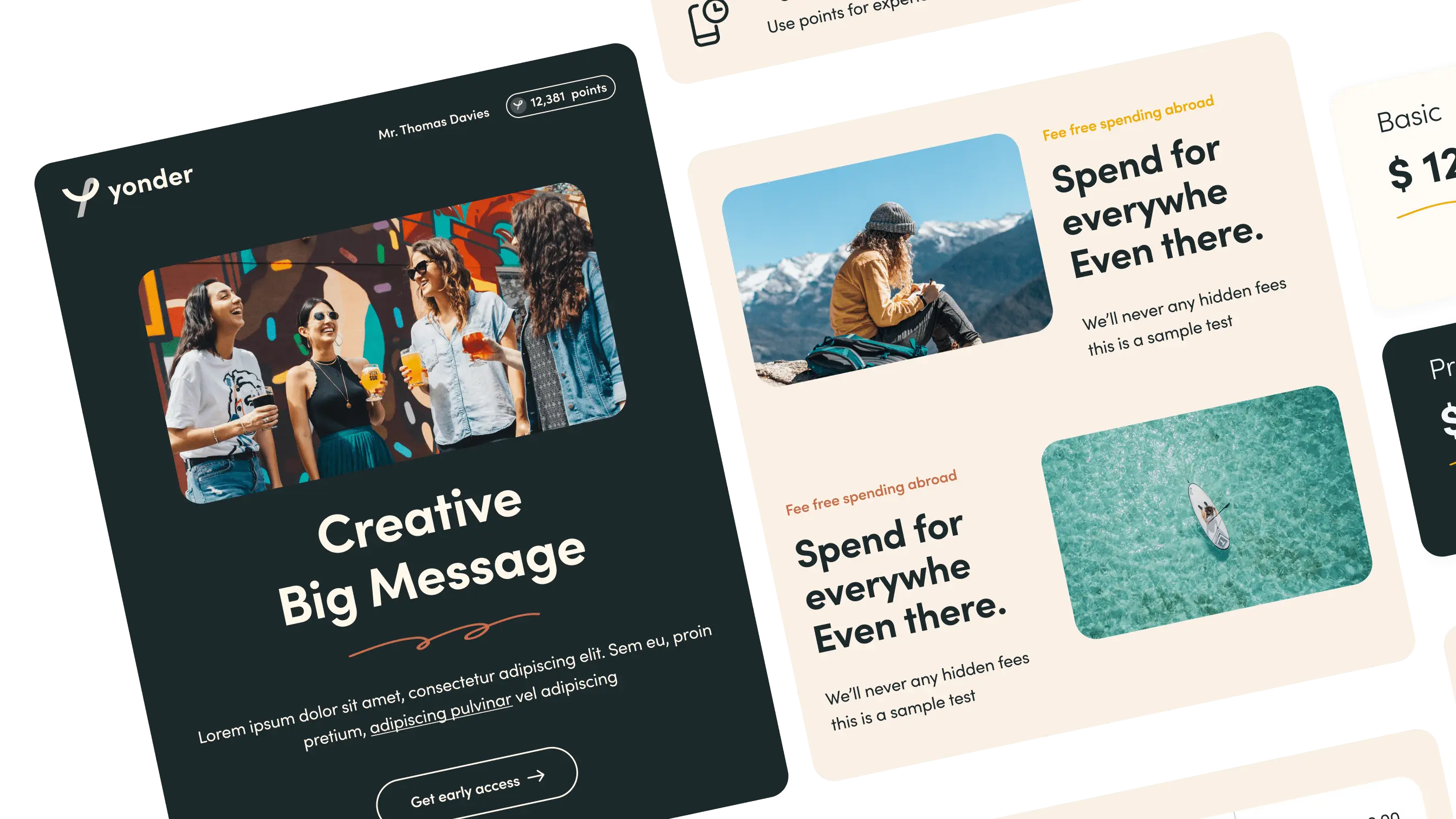
yonder team wanted their emails to really jump off the screen at their customers and feel like a product experience right in their inbox.

" Working with the craftingemails team was a breeze. We had a pretty good idea of what we wanted – we wanted our emails to really jump off the screen at our customers and feel like a product experience right in their inbox. After a kick-off call, the team got quickly to work adapting our ideas to something that would work in email. The team was thorough and thoughtful in their work, accounting for dozens of edge cases and working with us until we were really happy with the final designs. Super responsive, high quality, and for the cost. It was right in line with our budget. Thanks to this awesome team. We'll be back for more in the future!

Sherif Saleh Founder
Let's connect via email or schedule 30 minutes to call to discuss your project.
Schedule a call